Add the Check Balance Widget
Written By Giftnote Admin
Last updated Almost 2 years ago
Giftnote has the functionality to check the balances of gift cards via a block that be managed in the theme settings. This block can currently be added to the either product pages or the cart page
Product page installation
Staring from the Shopify theme homepage. Select the Homepage drop-down on the top of the screen and select products to access the product page. In the following tab, select the template used for the products usually, this will be the Default product.


On the left-hand navigation under product information select Add Block. In the following tab select the Apps tab and select the ‘Check balance’ option to add the Block.

The block can be moved by dragging and dropping the block on the left-hand navigation

Save the theme after adding the block via the button on the top right make the changes live

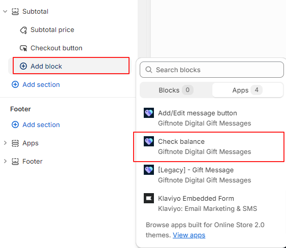
Cart page installation
Select the Homepage drop-down on the top of the screen and select Cart

On the left-hand navigation under Subtotal select Add Block. In the following tab select the Apps tab and select the ‘Check balance’ option to add the Block.
Note: Depending on the store the block may not appear unless something is in the cart.
The block can be moved by dragging and dropping the block on the left-hand navigation.

Save the theme after adding the block via the button on the top right,

Customisation options
The block has some customisation options if needed. To access these options select the block on the page on the left-hand navigation which will open up the options on the right-hand side of the page.

Note that these changes with need to be made to the cart and product pages separately.
Text options
The text can managed. This includes the heading text which can managed via input in the ‘Check balance label’ section. The font family section manages the font of the whole block and the font colour selection manages the colour of the heading and results. The colour can be set via the colour dropper or directly via the hex input.
Block design options
The colour and radius of the block itself can be managed under the style settings. The colours can set be via the colour dropper or directly via hex input. The radius of the border can be set by the slider or direct input in the field beside the slider but must be between the values of 2-50 px.
Button size and placement options
The desktop and mobile buttons are managed separately however they mostly share the same options. This includes button alignment and width. Alignment can be set via the radio buttons and is representative of the section it is in.
Width can be manually input in px in its respective field. There is a toggle for maximum width of the section which ensures that the block will always be at the full size of the section overriding the manual input.
Mobile includes the additional option for the breakpoint width which determines how wide the page needs to be before the mobile options are used.
Coding options
For more customisation options css code can be added at the very bottom of the section under the configuration section.